Beta60 components · React + Tailwind · shadcn
Ravox
Kit
React + Tailwind components with the Ravox UI look. One command brings the code into your project: it is yours to edit.
Start with the button
npx @ravox-ui/cli add buttonBasics
11 componentsAlertnewA message that stays on screen, inside the content: info, success, warning and error, each with its own icon. Title, text, an action that moves below when space is tight, and a close button.
AvatarnewA person's photo with initials as a fallback while it loads or if it fails, in four sizes, round or square, with a status dot. The group stacks avatars and sums up the rest as +N.

BadgeA neutral badge with a dot in the mosaic color, or filled (solid) for the state that needs to stand out.
ButtonThe everyday button: default, secondary, outline, ghost, destructive and link, plus the mosaic and the house key. With an icon, icon only, loading and as a link.
Button GroupnewNeighboring actions joined into one piece, horizontal or vertical: Publish | ▾, − 1 +, prefix + field + copy. Separator for solid buttons, fixed text and a toolbar mode with keyboard arrows.
EmptynewWhat appears when the list, the search or the folder has nothing: says what is missing, why, and offers the next step. Normal or compact (inside cards and menus), with a dashed border for drop areas.
KbdnewA key or key combination for menus, hints and the command palette. Write "mod+k" and Mac users see ⌘ K; on Windows and Linux, Ctrl + K. Screen readers hear the key name, not the symbol.
ProgressnewProgress bar with a label and value wired to it. Without a value, it is indeterminate while the remaining amount is unknown. The steps variant shows where the person is in a sign-up, checkout or import.
SeparatornewThe thin line between groups, horizontal or vertical, solid or dashed. With text inside, the label sits in the middle ("or", "Today") or at the start of the line.
Forms
14 componentsCalendarnewA month grid with the start of the week and names coming from Intl, in the user's language, with no date library. One day, a range (with a hover preview) or several days; locked dates, minimum and maximum, two months side by side and quick month and year switching from the title.
CheckboxnewA real checkbox with label, description and error, an indeterminate state for "select all" and a group with a legend. Sends name/value in the form and accepts React Hook Form's register() directly.
Color PickernewA button showing the current color that opens a layer with the saturation and brightness area, the hue bar, the value in HEX, RGB or HSL (editable), the eyedropper and swatches. Drag with mouse and touch, move with the arrow keys (Shift for steps of 10). No dependencies: much more polished than the browser's native picker.
ComboboxnewA field that filters a list as the person types. Accent-insensitive search ("sao" finds São Paulo), single or multiple selection with tags, groups, empty state, loading for server-side search and "Create …" when nothing matches.
Date PickernewA date field that accepts both: typing the date (slashes are added automatically, in the language's order: dd/mm/yyyy in Brazil) or picking from the calendar that opens on top. DateRangePicker takes a range with two fields, two months and shortcuts such as "Last 7 days". Warns about a date that doesn't exist, is out of bounds or unavailable.
InputnewA text field with label, hint and error already wired to the input, an icon or prefix at the start and an action at the end (generate, copy, show password). Accepts React Hook Form's register() directly.
Input OTPnewSlots for an SMS or email code, built on a single input: pasting the whole code fills every slot, the phone suggests the received code, and screen readers hear one field. Numbers or letters, separator, masked and error state; accepts React Hook Form's register().
Radio GroupnewA group of real radios, as a simple list or as cards with a title and description. Arrow-key navigation, native name and form submission come from the browser.
Segmented ControlnewFor switching between a few options, like 7d / 30d / 90d. As buttons, it is a radio group with arrow-key navigation; as links (asChild), it becomes navigation with aria-current. The active marker slides.
SelectnewSelect following the WAI-ARIA combobox pattern: arrows, Home/End, Enter, Esc and type-ahead. The list opens on the top layer, so no overflow: hidden clips it. Sends its value with the form through name.
SlidernewPick a number or a range by dragging: one or two thumbs, step, labeled marks, visible value and tooltip. Arrows, PageUp/PageDown and Home/End on each thumb; sends the value with name and works in React Hook Form's Controller.
SwitchnewOn and off for settings that apply immediately. It is a checkbox with role="switch": Space toggles it, the form receives "on" when it is on, and React Hook Form's register() returns true/false. With the label before it or at the end of the row.
Overlays
11 componentsAlert DialognewA question with the consequence and two ways out, for actions that can't be undone. It doesn't close on outside click, shows a loading state while the action runs and displays the error without closing. Also available as a promise: await confirm({ … }).
CommandnewCommand palette: search that filters as you type regardless of accents, groups with headings, synonyms, shortcuts and the empty state. Placed in the page or in a native dialog that opens with ⌘K / Ctrl+K. Arrows cycle, Enter selects, Esc clears and closes.
Context MenunewThe right-click menu, at the cursor position. It also opens with Shift+F10 or the menu key (next to the focused element) and by long-pressing on touch; the ⋯ button (ContextMenuTrigger) opens the same menu for screen readers and for people who don't know about long press. Uses the same items as Menu: checkbox, single choice, submenu, shortcuts.
DialognewA modal window built on the browser's <dialog>: the page behind becomes inert, focus is trapped and returns to whoever opened it. Closes on Esc, on the backdrop and on the X; header and footer stay fixed while the body scrolls inside when the content is tall.
DrawernewThe sheet that slides up from the bottom on mobile: handle, drag to close (a quick flick also counts) and optional height stops. On desktop it is centered at the bottom. Underneath it is the same <dialog> as Dialog.
Dropdown MenunewA dropdown menu with items, icons, shortcuts, groups with headings, checkbox and single-choice items, submenus and a destructive item. Full keyboard support from the WAI-ARIA pattern, with type-ahead, and it opens in the top layer: no overflow clips it.
Hover CardnewA rich preview of a link (profile, order, product) on hover. Opens with a delay, waits before closing and stays open with the mouse inside it. By keyboard it opens on focus and Tab enters the card.
PopovernewInteractive content attached to a button, without locking the page: quick filters, sharing, editing a value in place. Opens on the top layer, flips to the other side when it doesn't fit, moves focus inside and returns it on Esc.
SheetnewA dialog that slides in from a screen edge: filters, order details, a cart, editing without leaving the list. Fixed header and footer, scrollable body, focus trapped and restored as in Dialog.
Navigation
7 componentsBreadcrumbnewBreadcrumb: shows where the person is and the way back. Separator of your choice, the current level with aria-current and, when the trail is long, the middle levels collapse into a … that opens the list of hidden ones.
MenubarnewFile, Edit, View: the menu bar of an app, with full WAI-ARIA keyboard support. With a menu open, the arrow keys and the mouse move straight to the neighbor. Items with shortcuts, checkboxes, an option group and submenus.
Navigation MenunewThe top menu of a site: items with rich panels that open on hover or click, a highlight that slides behind the item, and WAI-ARIA keyboard support. When space runs out, it becomes a menu button with sections that open and close.
PaginationnewPrevious, next and page numbers with ellipses that don't make the buttons jump around. Shows "1–24 of 415", becomes real links with href (and Next's <Link> with link) and shrinks to "3 of 18" when space runs out.
SidebarnewThe navigation of an admin dashboard, in parts: groups, items with an icon and count, header and footer. Collapses to icons only (with a tooltip), remembers the choice, toggles with Ctrl/⌘ + B and becomes a drawer on narrow screens.
Surfaces
11 componentsAccordionnewFAQs, settings sections and details that open one at a time or several together. Real headings (h3), arrow keys to move between items, and animated height that becomes instant with reduced motion.
Aspect RationewHolds an image, video or iframe at a fixed ratio, so nothing jumps when the media arrives. Shows a placeholder while loading, fades the media in briefly and reports when it fails.
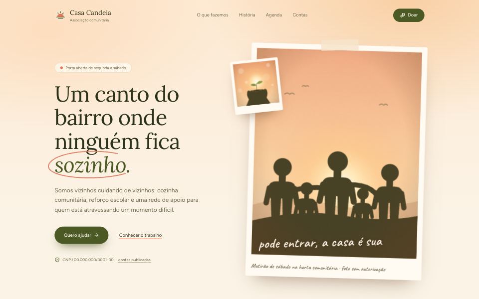
Browser WindowBrowser window with an address bar, to show sites and previews. The bar is neutral: the site is what stands out.
CardnewGroups a subject on one surface: header with title, description and an action in the corner, full-bleed media, body and footer. The whole card can be clickable without nesting buttons inside a link.
CarouselnewBuilt on the browser's scroll-snap: touch, inertia and trackpad work as in a normal scroll. Arrows, dots, keyboard, mouse drag, several slides at a time and autoplay that pauses on hover and focus and doesn't even start with reduced motion.

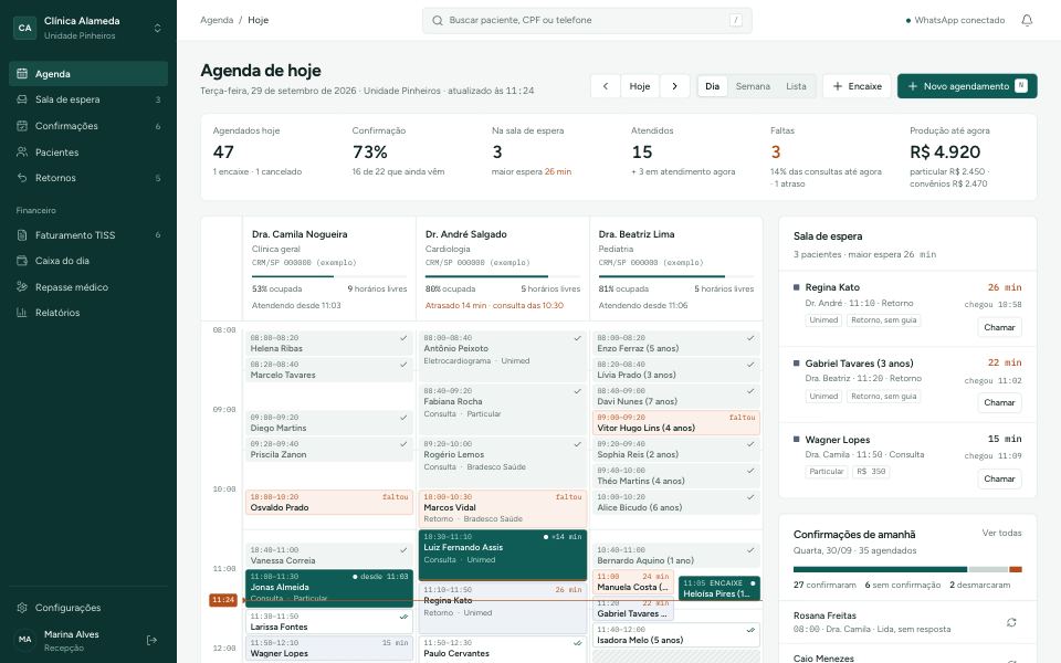
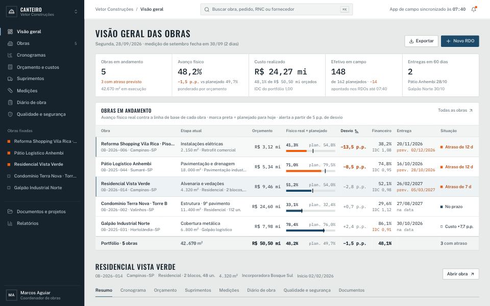
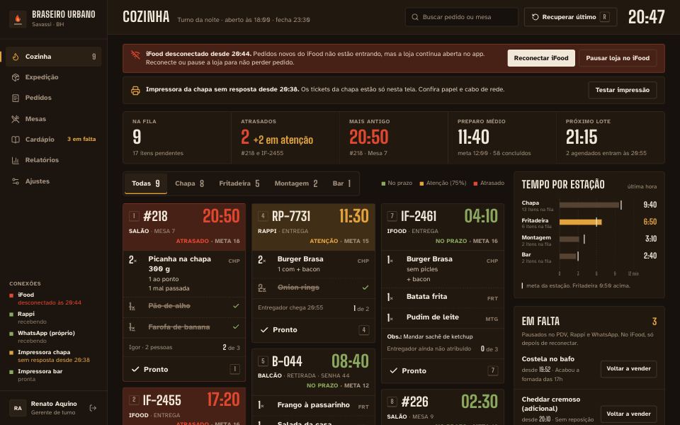
CollapsiblenewA trigger that shows and hides a section: advanced filters, order details, the full list of files. The height animates without measuring anything in JS and, when closed, the content is removed from Tab and from screen readers.
ItemnewThe row of every dashboard list: icon, photo or thumbnail, title, description and actions at the end. Groups with dividers between items, separates with labels, and can be clickable as a whole without putting buttons inside a link.
ResizablenewPanels side by side or stacked with a divider that you can drag, move with the arrow keys and collapse with Enter. Each panel has a minimum and maximum, and sizes can be restored on the next visit.
Data
4 componentsChartnewBars, lines, area and stacked bars in custom SVG, on a single axis. Tooltip on pointer and keyboard arrows, legend, end-of-line label and the same numbers in a table. House colors tuned and validated for color blindness. No chart library.
Data TablenewYou declare the columns and it sorts, searches (accent-insensitive), paginates, selects rows with bulk actions and shows/hides columns. Empty, no-results and loading states are ready. No table library.
Donut ChartnewA donut chart to show how much each part weighs in the whole: payment methods, channels, plans. The total sits in the center and becomes the value of the slice the person points at or selects with the keyboard; the legend brings value and percentage and the View table button shows the numbers.